
AWS User Group logos: templates and examples
Feb 09, 2026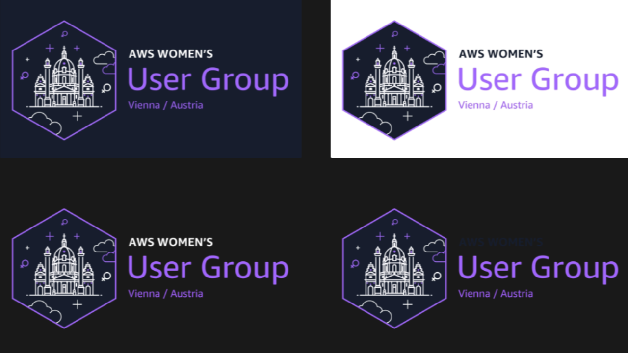
Why this became part of a bigger toolkit
I’ve been organizing meetups and supporting different initiatives in the AWS Community DACH region for several years. Over time, you start to see patterns - not only in how events work, but also in where things become unnecessarily difficult for organizers.
This story started with something very practical. For an event, we had the idea to include the logos of different user groups and their leaders in our visuals. Just a normal thing to do when you want to show who is involved.
Once we put the logos next to each other, it became obvious that they didn’t really work together. They all existed, but they didn’t look consistent. Different styles, different levels of detail, different formats. Some worked on dark backgrounds, some didn’t. Some scaled well, some completely broke when they were small.
Nothing about this was surprising. Each logo had been created independently, at different times, with different tools and constraints. But seeing them together made me think: it would actually be pretty cool if user groups in our region could use a similar style and design language. Not the same logo - just the same rules.
Supporting other user group leaders with their logos
That’s when I started helping other user group leaders create or adapt their logos. Not by taking control of their branding, but by supporting them with a structure:
- use a landmark that works as a silhouette
- keep it minimal and readable
- make sure it works as an icon
- export it in formats that are actually usable for events
The idea was simple: different cities, different identities - but the same design logic.
At first, this was very focused on the DACH region. It was about making our shared visuals look coherent and making life easier for organizers.
Turning the process into templates
After doing this a few times, I realized that I was repeating the same explanations and steps. So I started to document the process and turn it into templates.
This included:
- a PartyRock setup to generate initial logo directions
- prompt templates for minimal skyline and landmark-based logos
- Canva templates so logos can be reused and edited by future organizers
The goal was never to fully automate logo design. The goal was to give user group leaders a solid starting point and clear constraints.
The video - and what happened after
I recorded a video where I walked through the workflow and explained how I approach consistent user group logos. Mostly because people kept asking the same questions.
Designing consistent user group logos (YouTube)
After publishing the video, user group leaders from outside the DACH region started reaching out. Different countries, different cities - same challenges.
That’s when this stopped being a regional thing. I started creating additional logos for user groups outside our region as well, using the same templates and approach.
The full logo workflow (the exact way I do it)
This is the repeatable system I use to create consistent AWS User Group logos - fast, scalable, and usable in real community work. The tools matter, but the sequence matters more. The biggest unlock for me was: I always start with the mission. I generate it with PartyRock first, and then I let the mission guide the visual decisions.
Step 0 - What you need
City + group name (e.g., “AWS User Group Vienna” or "AWS Women's User Group Munich")
Use the PartyRock App and just enter the name and speciality of your User Group as well as the city it is located.
PartyRock app: CityLogoMaker
Quick context: PartyRock is an AWS tool that lets you build and use Bedrock-powered apps without writing code. I use my CityLogoMaker app to generate two things: a first visual direction for a city logo and a text description that connects the landmark to the user group’s mission.
Step 1 - PartyRock: generate the mission and some inspo
I use PartyRock to generate the mission and a short description for the user group as well as an inspo for a possible logo. Run this however often you want and add whatever context is important just to the City Name or Remix the the App and adapt it so that it truly reflects your User Group or Community. This text becomes the anchor for the entire workflow - and it prevents the logo from being “just a random landmark icon”.
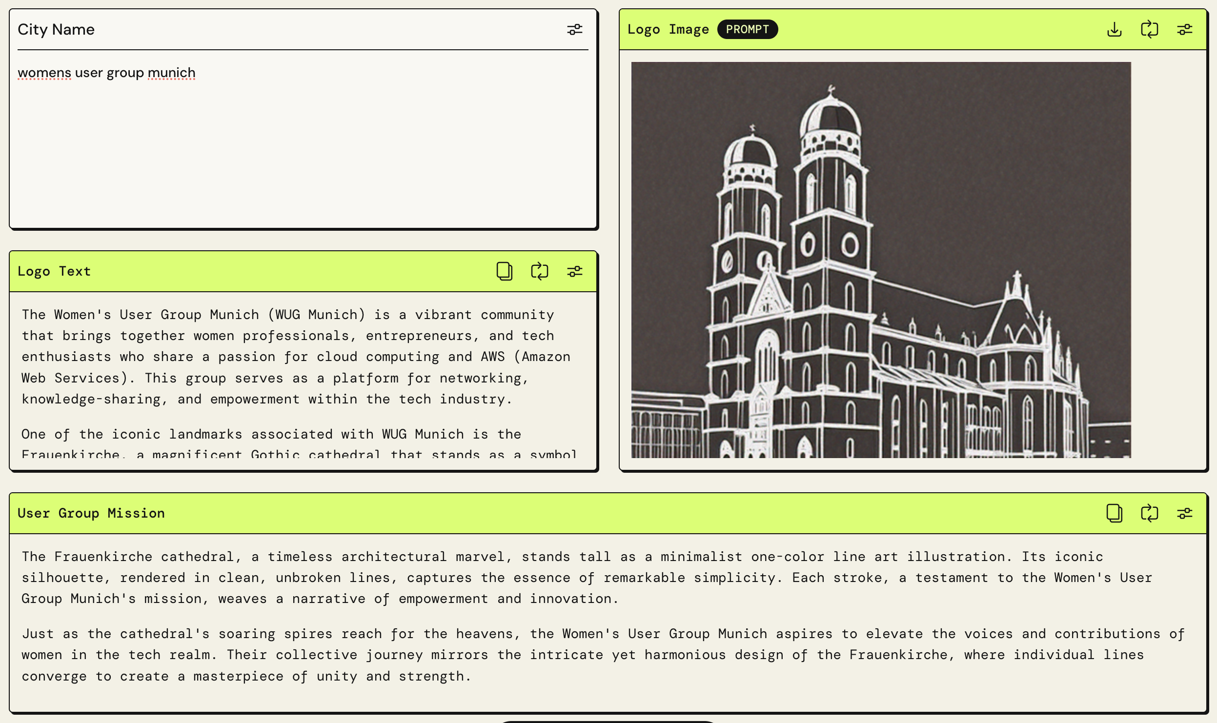
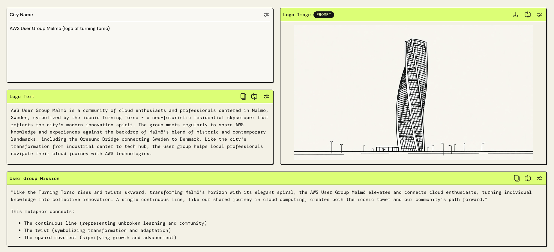
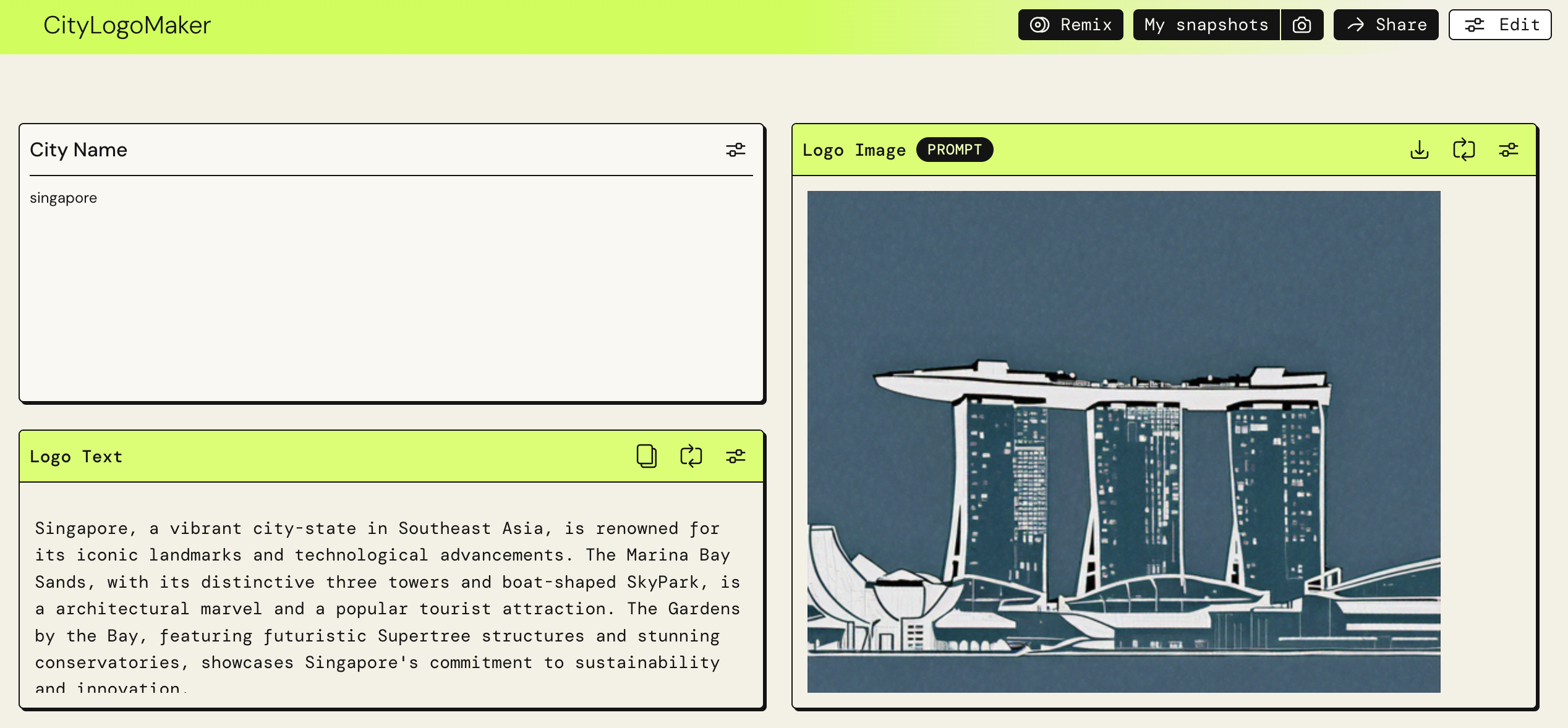
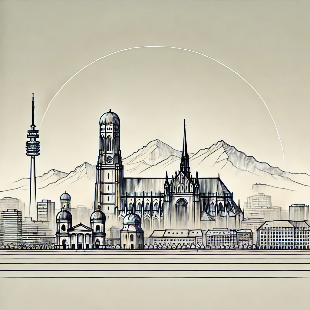
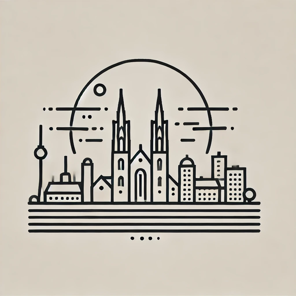
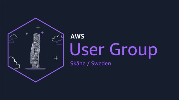
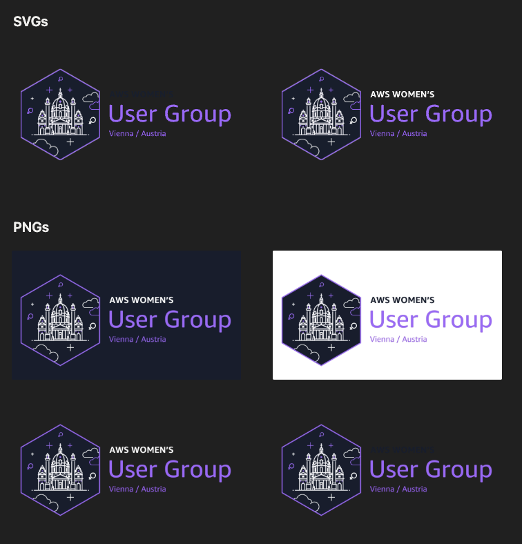
For Singapore, the candidates were Marina Bay Sands, the Merlion, Gardens by the Bay, and the Esplanade but with some additional user input we ended somewhere completely different, which is also fine. For Munich, the choice was almost immediate: the Frauenkirche. Those twin towers are one of the most instantly recognizable silhouettes. For Malmö, the Turning Torso was the clear choice - a residential skyscraper that spirals 90 degrees from base to top. For Vienna, we went with the Karlskirche and same for the Women's User Group because it is a spinoff from the still existing mixed User Group Vienna with the same logo - but the Women’s User Group still has some small specials in the design.
What you're looking for in a good landmark choice:
- Clean silhouette with distinct, memorable outline
- Not symmetrical in a boring way (some asymmetry helps recognition)
- Works horizontally - most logos are wider than they are tall
- Has cultural resonance with locals and is recognized internationally
Step 2 - PartyRock: generate more landmark ideas from the mission (optional)
Now I let PartyRock suggest landmark candidates that match the city — but I filter them with a “silhouette test”. If it won’t work at icon size, it’s not a good logo landmark (even if it’s famous).
PartyRock is not the end of the workflow. The images it generates are starting points, not finished products. But the images are valuable for two reasons. First, they help you see immediately whether a landmark can be simplified into a minimal logo. Second, the generated image gives you something concrete to show ChatGPT as a reference when you start the real iteration process.
The text output from PartyRock is even more useful. The app generates a description of the landmark in the context of the user group, connecting the architectural qualities to the community's values and mission. This text becomes part of the ChatGPT prompt in the next step.
My quick silhouette filter:
- Recognizable outline in one color
- Still readable at 48×48
- Works on dark and light backgrounds
Step 3 - Pick ONE landmark (don’t combine two unless you really have to)
For consistency, I usually pick one landmark silhouette and commit. If I mix two icons (e.g., a building + a statue), the logo often gets noisy and harder to scale.
Examples (real outcomes from my workflow):
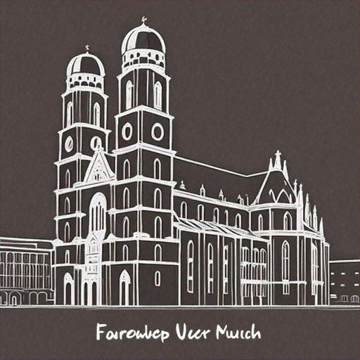
- Munich → Frauenkirche silhouette works instantly
- Malmö → Turning Torso style landmark (great silhouette character)
![]()
Step 4 - Create the first logo draft (AI image step)
Now I generate the first draft in a consistent line-art style. The first result is almost never final - it’s just the starting point that proves the landmark works.
4A) Baseline image prompt (copy/paste)
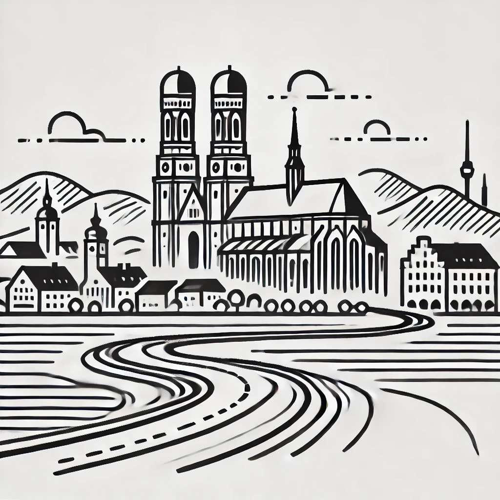
Design a minimalistic skyline logo for {CITY}, capturing the essence of its distinctive features. The design should include a winding street that runs through a prominent landscape feature, such as hills or waterfronts, incorporating iconic landmarks like notable buildings or historical structures. Focus on creating a linear and clean design that reflects the tranquility and unique character of the region. The skyline should be a stylized panorama, blending natural and architectural elements into a cohesive and attractive minimalist design.
Use the attached image of the landmark as inspiration for the style and simplicity.
Here is more inspiration and constraints:

Style: clean, linear, minimalist line art, one color.

Subject:
Use {LANDMARK_NAME} as the key silhouette element.

Rules:
- keep it simple, readable, not too detailed
- must work as an icon at 48×48
- balanced composition (not too tall, not too wide)
- no gradients, no shadows, no complex textures

Mission context (important):
{PASTE_PARTYROCK_MISSION_AND_KEYWORDS}

Deliver:
1) square logo composition
2) strong silhouette
3) consistent stroke thickness
What I attach as references (if the tool supports it):
- A clear photo of the landmark (good angle, high contrast silhouette)
- (Optional) A screenshot of a previous logo in my style to match the system
Step 5 — The simplification loop (this is where the logo gets good)
This is the core craft: simplify until it almost breaks, then go one step back. I do small, strict iterations. No essays. Just directives.
5A) My iteration prompt pack (copy/paste, use as needed)
Round 1 — remove detail
Make it simpler. Use fewer lines.
Keep only what makes {LANDMARK_NAME} recognizable.
Round 2 — icon test
Optimize for icon size (48×48). Too many strokes.
Reduce to the minimum necessary silhouette.
Round 3 — stroke consistency
Use consistent stroke thickness and clean continuous lines.
Remove tiny gaps and micro-details.
Round 4 — composition
Center the silhouette better.
Make the overall shape balanced and readable in a square canvas.
Round 5 — if it drifted
Go back to the previous version’s silhouette and style.
Keep that approach, but simplify further.![]()
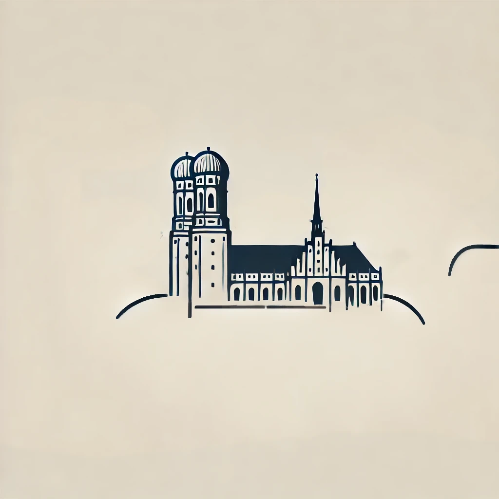
Step 6 — Export-ready assets (transparent background is non-negotiable)
I always prepare the logo so it can be used everywhere: slides, social, banners, stickers, email headers, and dark-mode backgrounds.
6A) Transparent background prompt (copy/paste)
Generate the exact same logo as a PNG with a fully transparent background (or use Canva Pro to remove the background).My file naming convention for dark and light mode
{city}_ug_icon_black_transparent.png
{city}_ug_icon_white_transparent.png
{city}_ug_logo_dark_bg.png
{city}_ug_logo_light_bg.png
Step 7 - Canva template: place the icon and lock the system
The icon is only half the work. The real “consistency system” happens in Canva: same layout rules, same spacing, same typography, same export formats. This is what makes multiple user group logos look like they belong together.
Templates (duplicate your own copy):
- Women's and mixed UG template: open template
7A) Canva steps (exact sequence)
- Duplicate template (so you own your copy)
- Upload your transparent PNG (black + white variants)
- Replace the placeholder icon
- Update city name + UG label (do not change typography)
- Export the required formats (see next step)

Step 8 - Final export checklist (what I deliver to every UG leader)
- Icon only (transparent PNG): black + white
- Full logo (with text): dark background version
- Full logo (with text): light background version
- Square size for profile pictures (500×500 or 1000×1000)
- Banner size (1200×630) for event visuals
Beyond logos: how we prepare and run our events
Once you start documenting one part of community work, it’s hard to stop. Logos were just the entry point.
Over the years, I’ve also built guides and templates around:
- how we prepare meetups
- how we find and approach speakers
- how we manage talks and schedules
- how we coordinate across multiple user groups
These are all things that user group leaders solve over and over again, often in isolation. The toolkit is my attempt to make that work more visible and more reusable.
What I want to enable
I’m not trying to standardize communities. I’m trying to remove unnecessary friction.
If templates help organizers focus more on people, content, and conversations, then they’ve done their job. If someone takes the templates and adapts them to their own context, even better.
That’s why this exists, and that’s why more of it will be public over time.
If you’re organizing an AWS User Group and want to swap notes or share what you built with these templates, feel free to reach out or follow along: LinkedIn, GitHub, YouTube.
